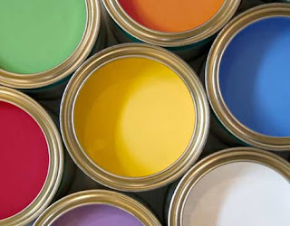
What are the colours of your company really saying about you?
Have you considered the subliminal messages that you could be sending out to your audience which could potentially impact their perception of your company?
It may or not be something that you’ve thought about but when you think about your own reactions to colour in terms of your perception of some the world’s leading brands such as Coca Cola you may begin to question your own use of it. According to colour experts red produces the most extreme responses from audiences within a business context. It’s hard to ignore it!
One of the most recent attempted changes of a brand to change its image with the use of colour was McDonalds when they redesigned their restaurant fronts and some of their interiors using a substantial amount of green. The intention behind it being to portray a sense of environmentally friendliness and sustainability, in a corporate and resource sense which was backed by changes to their corporate responsibility strategy.
When you think about it there are a substantial number of extremely successful brands which are predominantly employ the colour red in their imagery.
Virgin
Liverpool
Manchester United
Vodafone
Ferrari
McDonalds
Kellogg’s (the name is in red)
The trouble is that people have different perceptions and associations with colours depending on their own experiences, opinions and mindset. Of course there are generalisations you can make but again it doesn’t necessarily mean you have a fool proof plan. Colour on its own is not going to change the image of your brand or company but what is apparent is that it should be considered in the terms of supporting the message and identify your endeavoring to portray.
Test out colours and ask for feedback internally and from your audiences.
There are seemingly regional differences in responses to colour with UK audiences having the most extreme response. Males are also twice as more likely to have an extreme reaction to colour than women according to the results of a recent HP study.
We’re happy with our choice of orange what about you?
Orange is a warm, sensual, joyful, passionate, lively welcoming colour. e bay uses orange tones on its front page!
Royal Blue projects a sense of a solid, stable, trustworthy and powerful company, use Royal Blue. Think how government departments use Royal Blue in their logos & letterheads giving an impression of honour and power. Team it with red to add a hint of danger and excitement to the message.
Pale blue and pale pinks remind us of childhood, babies and children and are ideal for businesses that want to create a more caring, sharing image of young families etc.
Yellows can be cheerful and bright or brash and deceitful with undertones of cowardice. Use soft yellow tones and gold’s with strong colours like Royal Blue, Burgundy and Green for a fresh, bright image.
Green is seen as peaceful, passive, restful but boring and dull unless mixed with warmer flower colours of apricot, orange and reds. Remember the saying “Green with Envy”!
Avoid browns to express your business identity. Browns are earth colours, warm, solid, dependable, sensible but are found by most people to be unimpressive, dirty, dull, boring, unexciting.
Reds, blue-reds and orange tones are vibrant, hot, passionate, exciting, aggressive, dangerous, evoke a ‘don’t touch’ image. Used in moderation they can be warm but firm at the same time.
Violet, Mauve and Purple colours are used to express mourning and grief, are dignified, mysterious, wise, solitary, authoritative colours and best used with tons of white.
Grey, Grey Mauve & Grey Green colours are sad, old, mournful colours and invoke images of lonely, dull, lifeless times. Prime Minister John Major was nick-named ‘The Man In Grey’!
Black is a powerful, dramatic, sophisticated, serious, dignified, elegant colour but can also invoke images that are wicked, sad, evil, gloomy and withdrawn.
White is a pure, innocent, youthful, faithful, simple, honest peaceful colour.
No comments:
Post a Comment